Comparing Configuration Performance Using Graphs
After having cloned a configuration and its associated graphs, the next logical step is to compare the performance of the configurations in various ways. The first comparison method we'll look at uses graphs.
An Example of Performance Comparison Using Graphs
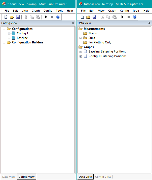
For our example, we'll use the project named tutorial-new-1a.msop from the downloadable tutorial examples. In this example, there are two configurations: one called Baseline that reflects the performance prior to optimization, and an optimized configuration called Config 1. Each configuration has a single graph that displays the responses at the three listening positions specified. This situation is shown below.
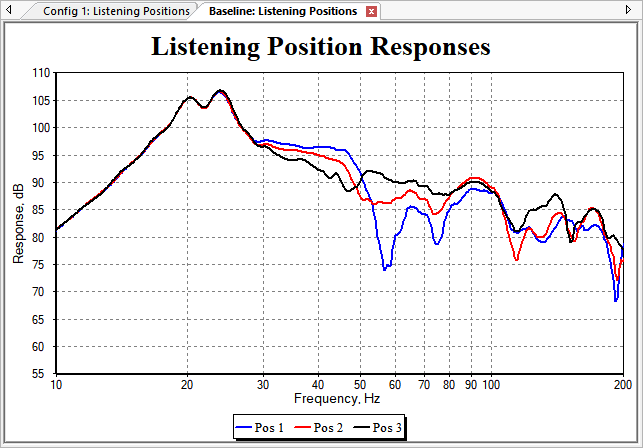
The graph of the Baseline data is shown below.
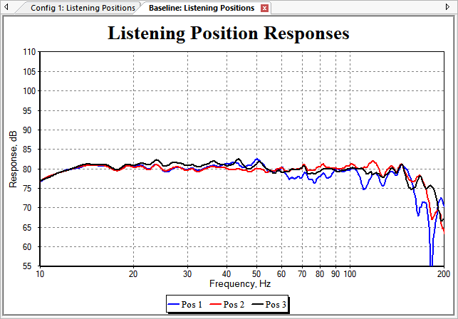
The graph of the Config 1 data is shown below.
These graphs were both created using the Configuration Wizard. We'd like to put both sets of traces on the same graph for comparison. To do that, we need to create a new graph manually.
Creating a New Graph Manually
To create a graph for comparing the before and after data, select Graph, New Graph from the main menu. This will create the graph and launch the Graph Properties dialog.
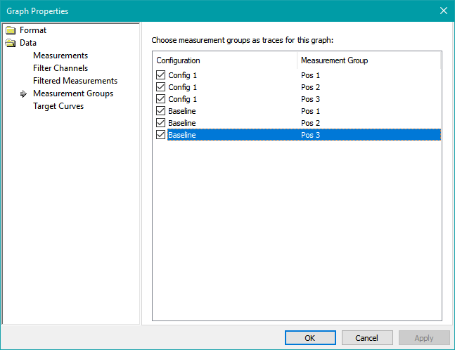
Selecting the Desired Data for the Graph Traces
Under Data, select Measurement Groups. These are traces representing the listening positions Pos 1, Pos 2 and Pos 3 for the Config 1 and Baseline configurations. Select all six traces as shown in the image below, then press Apply to show the traces on the graph.
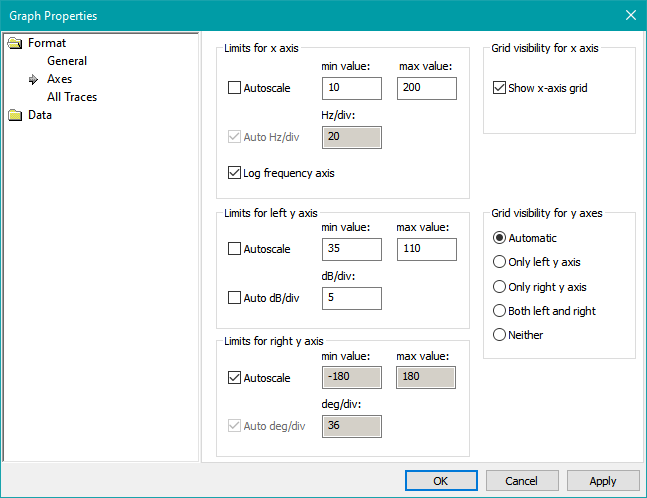
Changing the Axis Limits
Next, choose Format, then Axes. For the x-axis, choose minimum and maximum limits of 10 Hz and 200 Hz respectively, as below. For the left y-axis, uncheck Autoscale and specify minimum and maximum limits of 35 and 110 respectively as in the figure below. Next, uncheck the Auto dB/div checkbox, and keep the default value of 5 for the dB/div value. Press Apply again for the changes to take effect without closing the Graph Properties dialog.
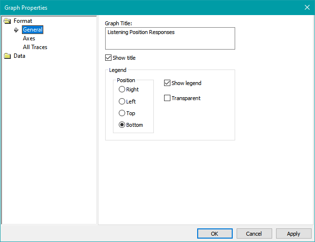
Changing the Graph Title and Showing a Legend
Next, we'll add a legend and change the default title of "SPL vs. Frequency" to "Listening Position Responses". Choose Format, then General. Enter "Listening Position Responses" (without quotes) into the Graph Title edit box, and check the Show Legend option. The Graph Properties dialog should look as below.
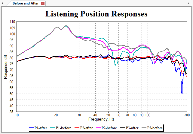
Click OK when done. The graph will appear as in the figure below.
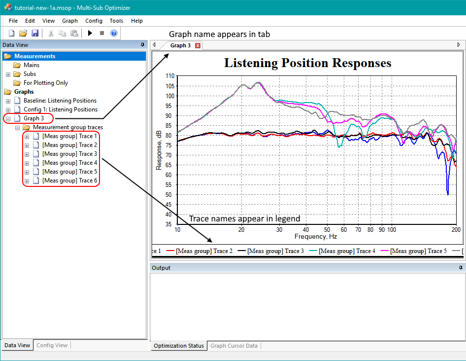
In the image above, annotations have been added showing where the graph name and trace names are displayed. From this result, we can see that three things need to be changed.
- The graph name needs to be made more descriptive.
- The trace names need to be made shorter and more descriptive.
- The traces for the optimized condition need to be shifted down on the graph.
Fixing up the Graph and Trace Names
Renaming the graph is easy: just select the graph name, press F2 and enter a new name. But renaming the traces requires expanding their display in the Data View to see their configuration and listening positon names. We'll call the listening positions P1, P2 and P3, the condition before optimization "before", and the condition after optimization "after". So we'll have trace names such as P1-before, P1-after and so on. The process of expanding the trace information and renaming the traces is illustrated below.
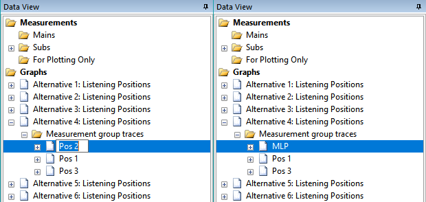
The traces referring to the Config 1 configuration now have "after" in their names, while the traces referring to the Baseline configuration now have "before" in their names. After renaming the graph and its traces, the new graph looks as below.
All that's left to do is to shift the traces of the optimized configuration down, so they're separated from the others.
Offsetting the Optimized Graph Traces
To change the trace offsets, we need to use the Trace Properties dialog. Right-click on the graph and choose Trace Properties as below.
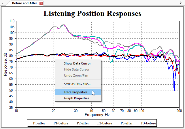
This will launch the Trace Properties dialog shown below.
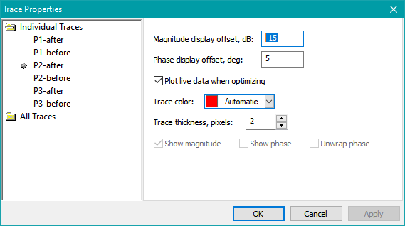
On the left side of the dialog, select each trace with "after" (the optimized condition) in its name. In the Magnitude display offset, dB edit control, enter -15 to shift the trace down by 15 dB. You may want to try the Apply button to test out your changes and verify that you're offsetting the right traces by the right amount. When done, press OK. The modified graph should now look as below.
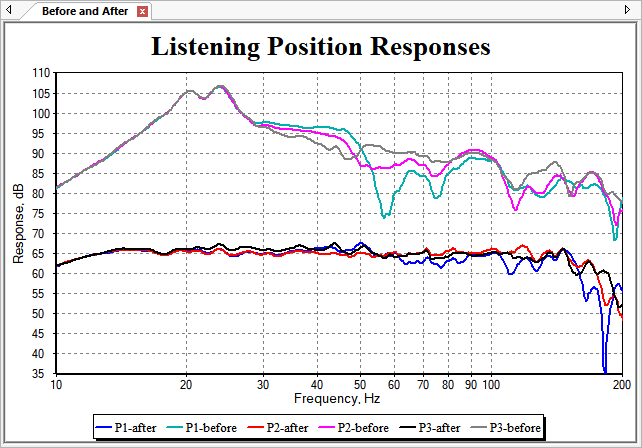
Now we have a good way to do visual, qualitative comparisons between the performance of various configurations. We'll explore a quantitative approach to performance comparison using the Configuration Performance Metrics dialog in the next topic.